Day 7: Cleanup UI
Today was the final day working on v0 of our Crafting System. We updated the restyled the crafting container UI to scale with the size of the underlying grid, added buttons to switch between crafting container types, and added a simple item menu to allow the user to add and remove items in the crafting container.
Table of contents
Today’s Goals
-
Restyle Crafting Container UI to scale with grid size -
Add buttons to switch between Crafting Container types -
Add "simple" inventory to allow adding / removing items
Scale Crafting Container with Grid Size
On Day 6, we finished with a functional crafting container that loads the grid based on the specified CraftingContainer and allows the user to combine the contents. However, the UI was horrifically bad because it did not properly scale with the users resolution. This resulted in the grid extending beyond the bounds of its container as well as the fonts scaling awkwardly.
After much research, a member of the crew pointed out that the PanelSettings of a UIDocument could specify a ScaleMode that allowed us to work within a specific resolution and scale appropriately:
This solved the problem with the grid overflowing when the resolution was too small. However, it did not prevent the grid from growing beyond the size of the UI if it contained too many rows or columns. To solve this, we utilized the flex-grow and flex-basis styling in our USS to enforce that each row had the same height and each cell within the rows had the same width:
.flex-grid-element {
    flex-grow: 1; /* row/column will grow with a weight of 1 */
    flex-basis: 0; /* Contents of the grid are ignored */
}
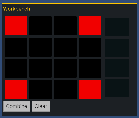
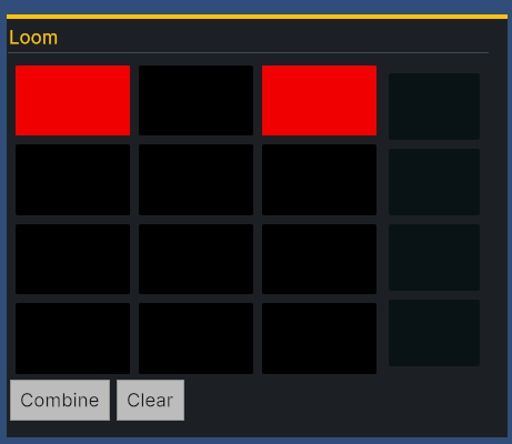
This looks reasonable when the rows and columns are similar in size:


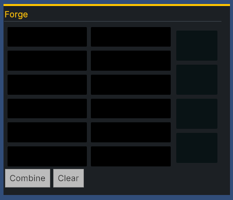
However, not so much when the shape is more rectangular:

In the future, I would definitely like to fix this and find a convenient way to force the grid to be square without the need to specify a width / height.
Dynamically Switching Containers
At this point, the UI was rendered based on the Crafting Container specified in the inspector and could not be changed during play. The next step was to add buttons that allowed us to set the Crafting Container at runtime and dynamically draw the grid to the screen.
To do this, we created a new UXML document CraftingContainerSelector which is a very simple flow container for buttons. Additionally, we wrote a MonoBehaviour specifying the possible CraftingContainers that could be selected and upon Awaking, the appropriate buttons are added to the UI:
public class CraftingContainerSelector : MonoBehaviour
{
  [SerializeField]
  private List<GameCraftingContainerData> _craftingContainers;
  [SerializeField]
  private CraftingContainerUIController _craftingController;
  private void Awake()
  {
      VisualElement root = GetComponent<UIDocument>().rootVisualElement;
      VisualElement containerEl = root.Q<VisualElement>("Container");
      foreach (GameCraftingContainerData container in _craftingContainers)
      {
          Button button = new() { text = container.Name };
          containerEl.Add(button);
          button.clicked += () => _craftingController.SetCraftingContainer(container);
          button.SetEnabled(true);
      }
  }
}
With this in place, we added each of our predefined crafting container scriptable objects to the CraftingContainerSelector in the inspector and it worked like magic!
Add Item Buttons to UI
To be able to test the crafting containers, we needed the ability to dynamically add items during play mode. To do this, we created yet another UI FakeInventorySelector which was almost identical to the CraftingContainerSelect except it had buttons which would add an item to the currently selected container. After doing this, we could add items to containers, drag the about, attempt combining them, and marvel in our simple crafting system:
And with that, we had a very simple working crafting system!
Join the Discussion
Before commenting, you will need to authorize giscus. Alternatively, you can add a comment directly on the GitHub Discussion Board.